Baller Mind Frame’s No Layups brings you the hottest NBA stories on the web mixed with personal opinion from our very own Aaron Lanton. Check it often and absorb the knowledge we’re dropping on you!
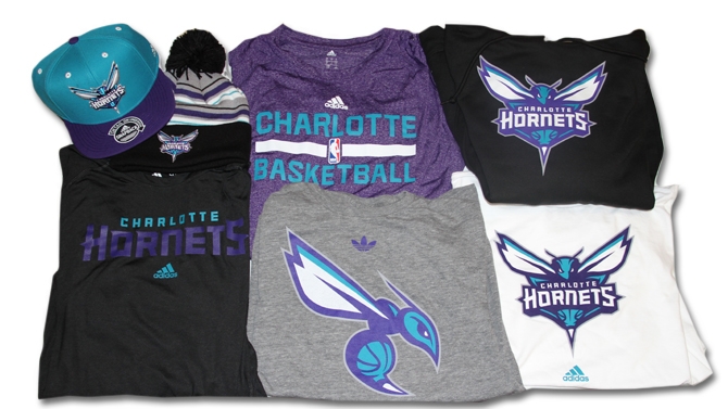
All images courtesy of Charlotte Bobacts.com
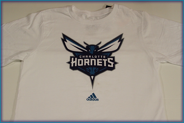
The Bobcats won’t officially re-brand as the “Charlotte Hornets” until after the 2013-14 season, but that hasn’t stopped them from unveiling shirts and hats that bear the team’s new logos.
Owner Michael Jordan unveiled new logos for the Hornets during a halftime ceremony back in December, and gear bearing that artwork will be available for purchase at the team store later this week.
The new primary logo, set in a teal and purple color combination, features a head-on look at a Hornet with a basketball design and the words “Charlotte Hornets” in block letters. SI.com
The primary logo utilizes the purple and teal color palette and features an aggressive-looking hornet that is ready to attack. Its piercing eyes, raised antennae, expanded wings and pointed stinger depict its relentless intensity. Incorporated within the logo is a basketball that doubles as the hornet’s body. The Charlotte Hornets wordmark is written across the insect. The logo contains several odes to that of the original Hornets with its white wings, white accents within its eyes, a stinger and the inclusion of a basketball.

