The Golden State Warriors have had quite a season in 2014-2015.
Superstar point guard Stephen Curry is the Most Valuable Player, shooting guard Klay Thompson has easily ascended to the watch list for the next great wing behind James Harden, and Draymond Green has become something of a destroyer of NBA worlds against the 29 other teams in the league (or 28, depending on what happens in the NBA Finals) something a vast majority of teams never thought Green would be upon his graduation from Michigan State University in 2012. The team is the best in the league, and rookie head coach Steve Kerr improbably coached his ass off, somehow revving up the engine of a team that was plenty primed by former head coach Mark Jackson (who transformed the Warriors from an also-ran to a playoff contender in a measly three years).
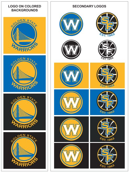
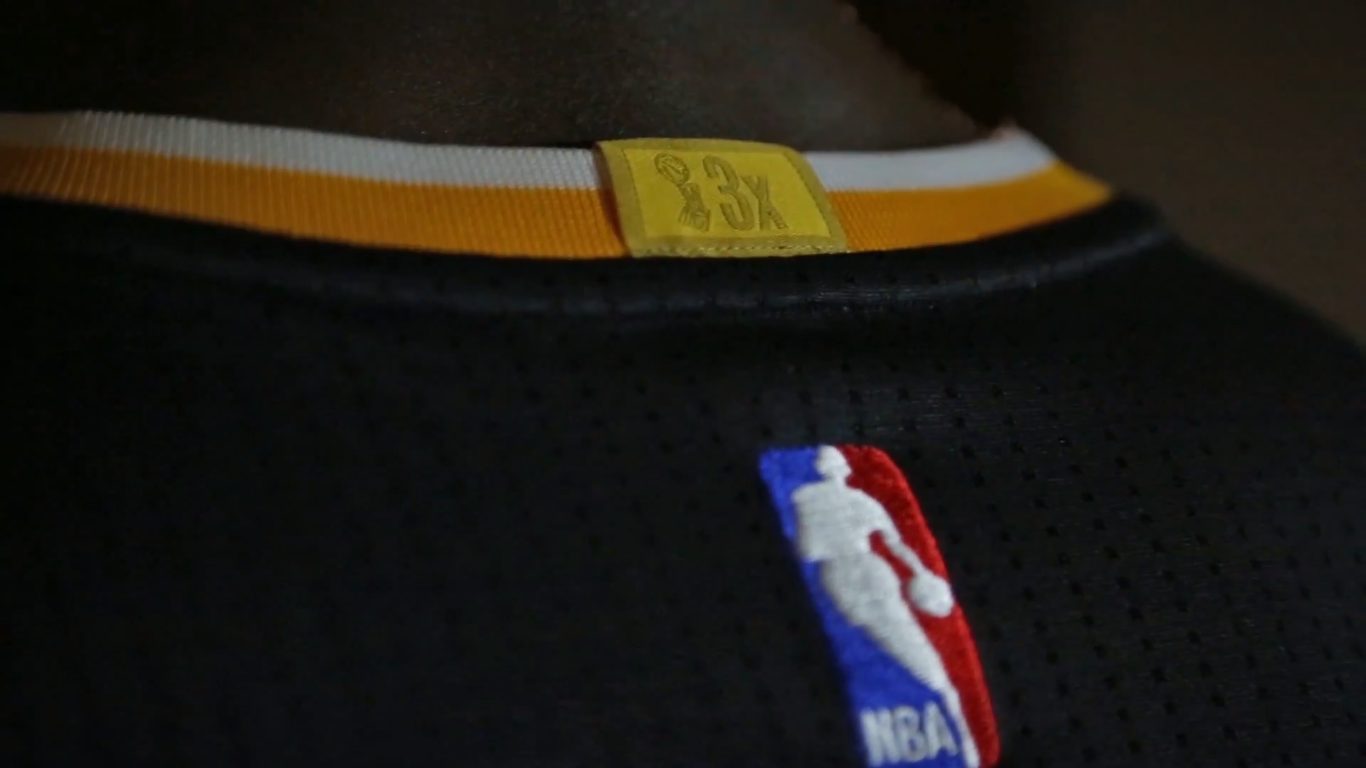
The Warriors have done all this in their royal blue and yellow-gold uniforms. Those sweet, pretty unis that have given fans and admirers of the team visions of those old San Francisco days that the Warriors played in upon arrival to California from Philadelphia, PA. But now, as we’ve all seen, they decided to throw slate grey into the mix of the team color scheme to create a hardwood “armor designed for the court” upon the season’s start, and it was and remains a curious decision.
 The thing about the new inclusion of slate grey is that it wasn’t particularly necessary. The Warriors had a really impressive goldenrod (sleeved) uniform that was both interesting and classic in its design, and it was scrapped after one season. Golden State also wore a sleeved version of the home white uniform for special home games as well, and that too was scrapped.
So, if you’re scoring at home, that’s two alternate uniforms that have been scrapped by the Warriors after one season each, and each uniform used a central hue from the team color scheme.
So why would the Warriors think of introducing a black-ish, but-not-actually-black color into a logo and color scheme that was already excellent as it was? We may never know that answer, but we do know this — Golden State wanted to do something different, and the slate grey alternate uniform does just that.
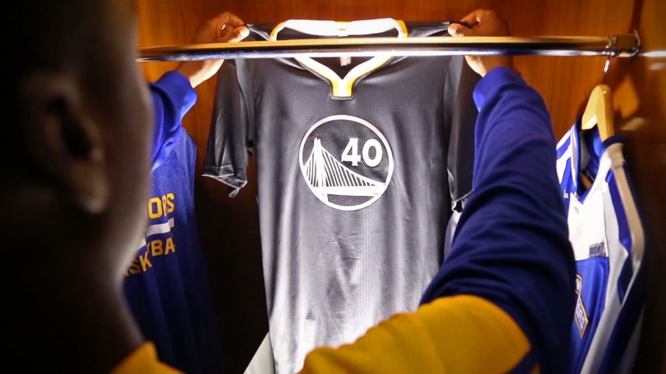

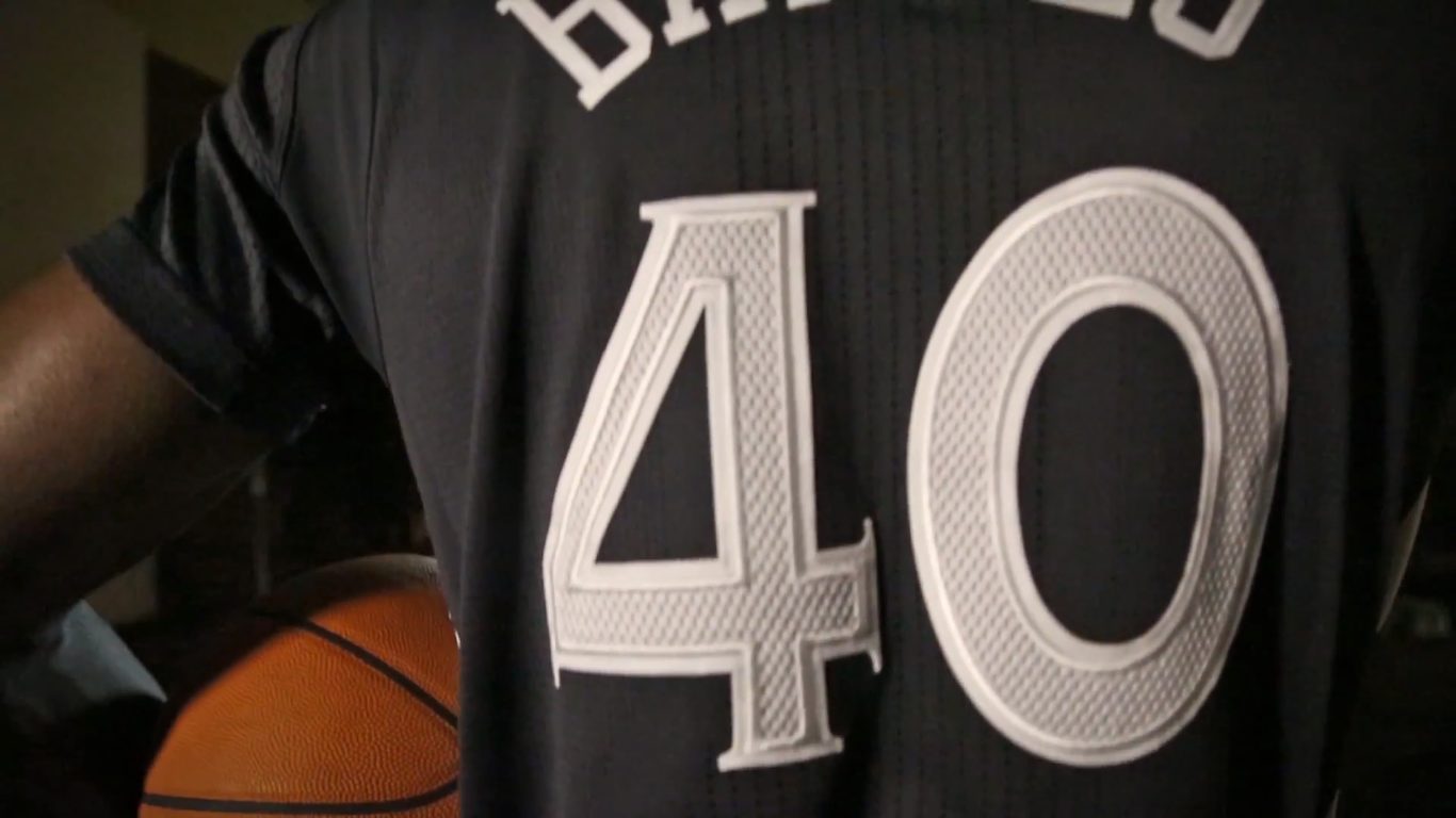
It’s not a bad look, and the main reason for that is the fact that the Warriors uniform design is very strong. The unique emblem on the torso, the handsome numerals, and the side panel striping and piping of the jersey and shorts make for a strong set, regardless of the color.
It’s a curious thing to add a dark grey/black to a color scheme. It’s neutral, so it doesn’t particularly take anything away from the blue, yellow-gold/goldenrod, and white combination, but does the slate actually add anything to the team color identity? Not necessarily in the way the Warriors employ it. Goldenrod and blue remain sharply segregated from the slate body of the uniform, making their presence known many on the trim areas of the look; white accents the slate body on the numerals, name, and major aspects of the paneling. This makes the use of slate very puzzling.
Like the logos shown above, slate looks pretty good in concert with goldenrod and blue, because it accents with white to give a tri-fold color identity. It’s why most teams employ the use of three colors as a base — the variety of three gives a solid foundation for an identity — but making a grey uniform that only interacts with the other neutral hue seems almost obtuse.
Nevertheless, the armor uniform works. Just not as well as it could.


[youtube]https://youtu.be/zHWk0Mq6uHo[/youtube]
Images courtesy of the Golden State Warriors; post-production by Sandy Dover