Far be it from me to comment on the style and fashion sense of anyone, let alone an NBA franchise. Usually my outfit selection process involves a simple comparison of cleanliness to a lack of wrinkles and away I go. My hometown Toronto Raptors have a freshly unveiled look heading into the 2015-16 season, and the reviews are as mixed up as a Rubik’s Cube.
The commotion began around April of last year when the club released the new logo concept right in the middle of the playoffs. Many criticized the timing as the knowledge of a change in team design meant that some consumers would be less likely to purchase merchandise during the current playoff push (disaster). The full design compliment is now out for review, the brainchild of ad agency Sid Lee, OVO, and the Raptors management. adidas, who own the contract for all official NBA league apparel, will do the production. This release is one of the final pieces in a total team rebrand that began when the team hired Toronto based rapper Drake as a brand ambassador.
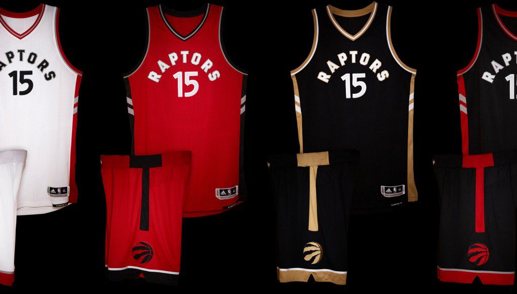
Part of the rebrand has been to showcase the Raptors as Canada’s team. As the only NBA franchise to currently reside outside of the United States the Raptors may feel as though they have a unique way to market the team gear to Canadians. This is a trend that the Raptors may have seen work with the Toronto Blue Jays, who also went very “Canada heavy” with a lot of their brand redesign and alternate jersey concepts. As a part of this process, the Raptors jerseys no longer display “Toronto” across the front. Now displaying “Raptors” in it’s place. Toronto is a bit of a polarizing city for most Canadians. While nearly a third of the population of Canada lives within a few hours of the downtown Toronto core, there are negative views towards a disproportionate amount of infrastructure support from those living outside the Greater Toronto Area (GTA).
Continuing with the theme of a more nationally unified Raptors front “We The North” is a prominent feature in the new uniforms. The waist level hem of the jersey has the slogan stitched in with a tag. The tag is stitched in upside down so it’s readable when flipping the jersey up and out. There is also a maple leaf of the front waistband of the shorts. This would be a departure from the maple leaf that was above the name and number on the backs of the jerseys in the previous design.
Lest you think the Raptors have turned their back on the city they call home, there is a subtle nod to Toronto on the shorts. The left and right side of each short leg has a “T” stitched into it, starting at the waistband. Beneath the “T” is the new Raptor logo, which is shaped like a basketball, or “O”. The collection of new uniforms also features a Drake requested black and gold colour scheme. Things certainly have come a long way from the purple and red Raptors that came into the league back in 1995.