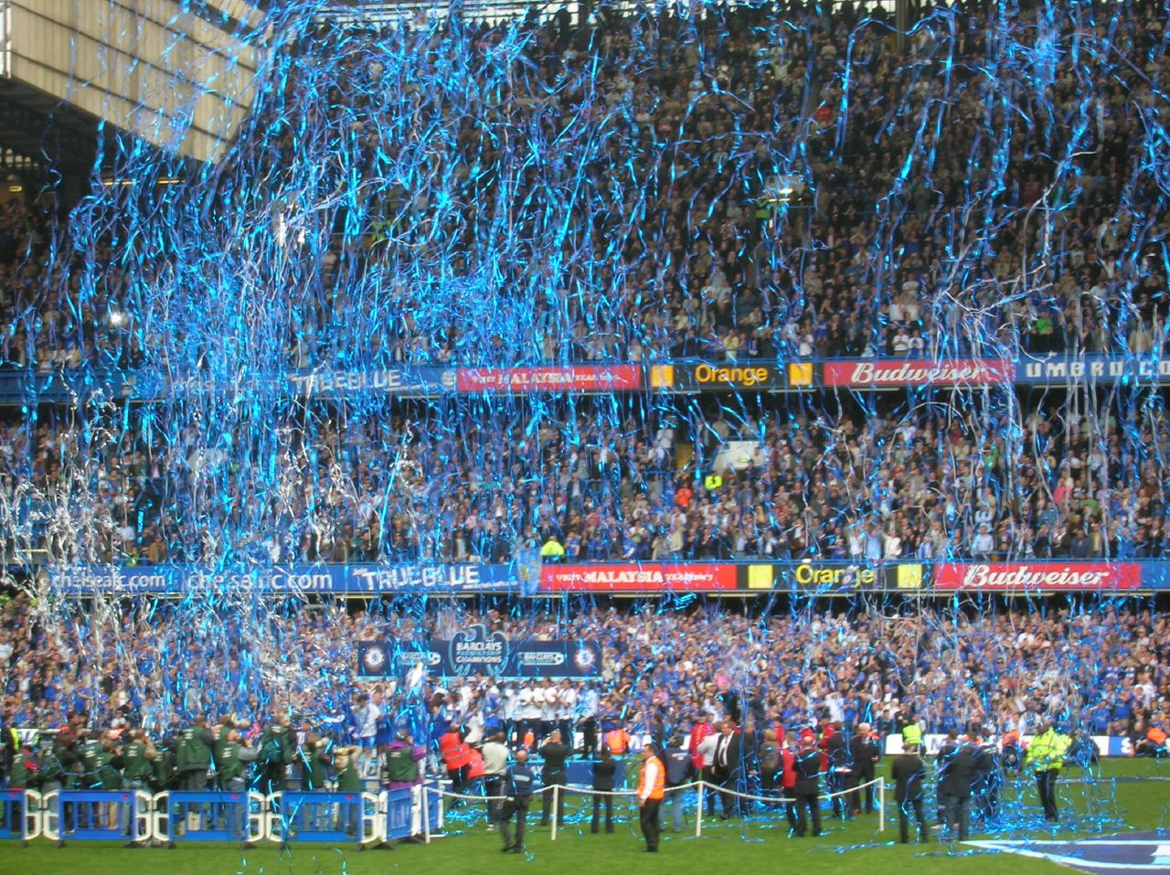
It’s always exciting when clubs unveil their new jerseys for the start of a campaign. Some are designed to perfection, while others cause you to scratch your temple in confusion. With the 2015-16 Barclays Premier League season upon us, BMF Sports takes a look at some of the best and worst kits that will be worn by the 20 clubs involved, and rate them out of five-stars.
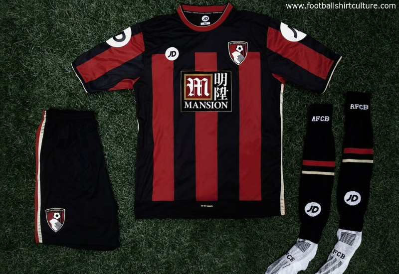
AFC Bournemouth (JD)
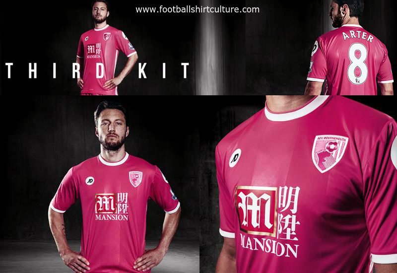
Last season’s Championship winners, Premier League new boys and first timers, AFC Bournemouth, bring a fresh look to the league with a black and red striped affair; a design they have used for over 40 years. Being a season of firsts, Bournemouth have changed brand manufacturers from Carbrini to its owner, JD. JD is better known as a sports shop in the United Kingdom that is frequented by anti-social hoodie wearing teenagers and benefit scroungers. A point is lost owing to the garish badges on the sleeves which look like they should belong on a referee’s kit. The Cherries share a kit sponsor with Crystal Palace but it aesthetically suits this kit so much more. With an uphill battle to remain in the Premier League, an adorable sentence “Together, anything is possible” is printed inside the collar. Bournemouth wins the prize for the strangest crest award, that header is going nowhere. The south-coast outfit also gain kudos for a pink third kit design in which 5% of sales will go to charity for breast cancer.
Home kit (4/5) – Third kit (4/5)

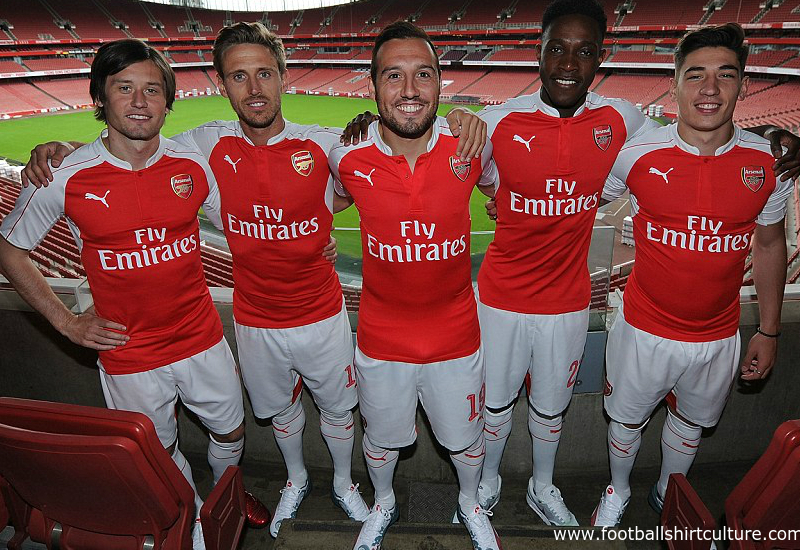
Arsenal (Puma)
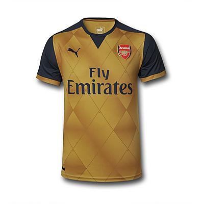
Arsenal’s 2014/15 kit was much better than this season’s pile of tripe. The white on the back looks like an afterthought and makes the Gunners look like choirboys. It appears they have also adopted the Tampa Bay Buccaneers digital LED style of number printing which only makes things worse. The away kit is gold with a diamond design. The sleeves are a dark grey with gold trim. Both kits are an all the rage slim fit which will do nothing for the beer bellied Arsene Wenger boo-boys who will be screaming for his name come their first loss of the season.
Home kit (2/5) – Away kit (4/5)

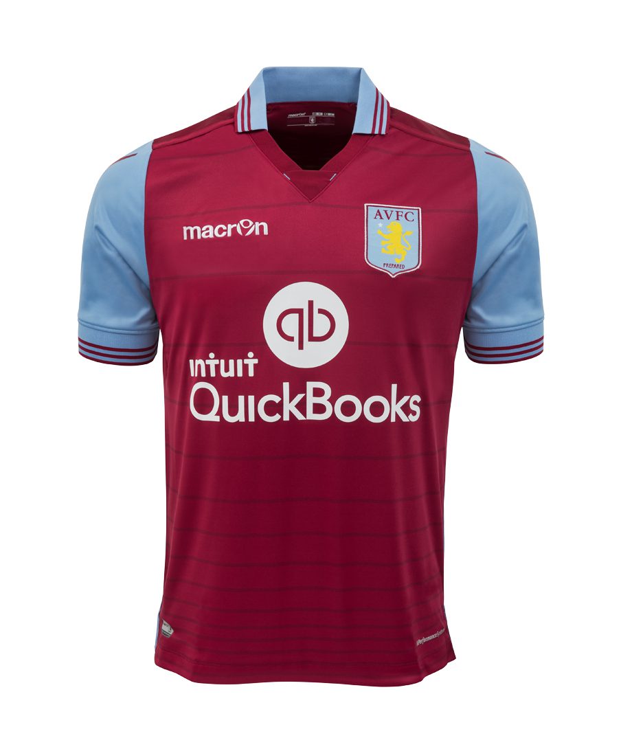
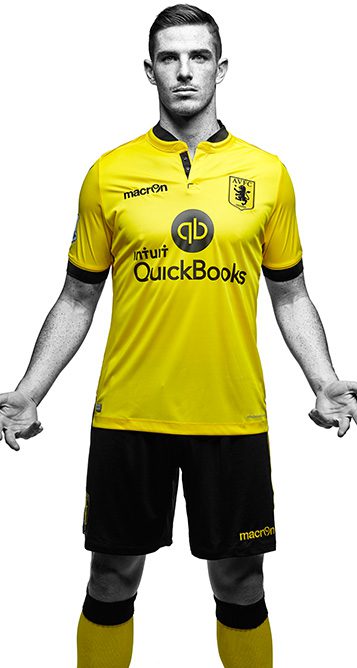
Aston Villa (Macron)
“The players have a duty, a responsibility. This is a big club” Ruh-Roh. Relegation alert. Aston Villa released their kits with a series of quotes from Mr. Banter himself, Tim Sherwood, as well as the nifty hashtag: #sayitlikesherwood. The embroidered “Villains” on the back of the shirt, vertical stripes across the body, and collar are nice touches. With Burnley’s relegation last season, the Premier League is reduced to two sides donning claret and blue with West Ham’s looking so much better. Villa loses points for having midlands rivals, West Bromwich Albion’s former sponsor and “when you can’t be original, go for yellow” away kit.
Home kit (3/5) – Away kit (3/5)
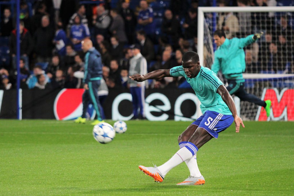
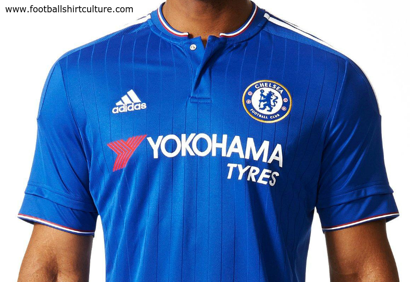
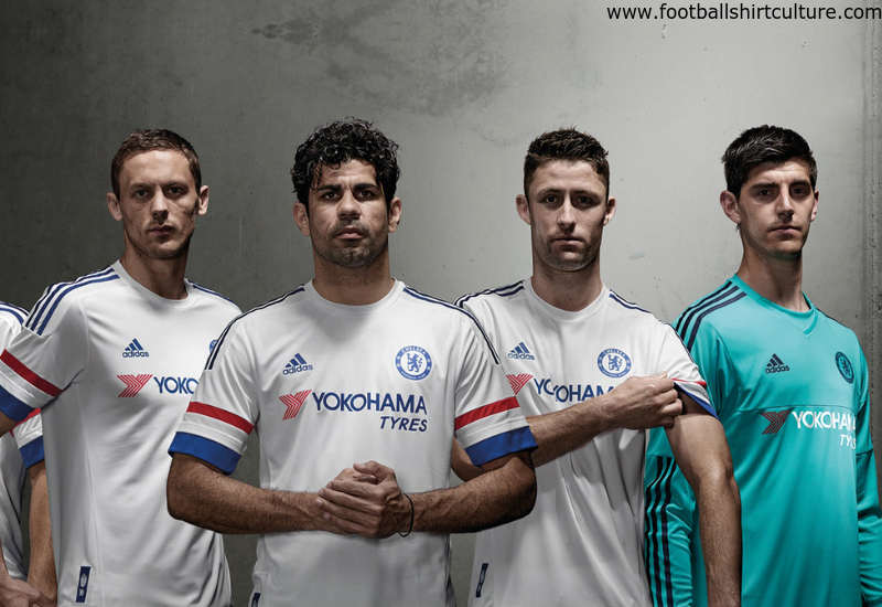
Chelsea (Adidas)
“Blue is the color” sing the Chelsea fans, albeit with a trim of red and white. The reigning Premier League champions say hello to a new sponsor in Yokohama Tyres in a deal worth a whopping $300 million over 5 years. The sponsor blends in perfectly with this simplistic kit. According to Footballfasion.org, “The vertical pinstripes underline the celebration of Chelsea’s history, having been a feature of several iconic shirts from the past 30 years.” Chelsea lose a point because the sleeves look like they contain an undershirt and they resemble a French flag on the away kit. A unique but bizarre feature is that each shirt contains a fingerprint woven onto a label. This finger print is meant to bring the individual closer to the club. Nothing brings you closer to your favorite team than forking out $100 for a new shirt every year. Nice job, Mr. Abramovich.
Home kit (4/5) – Away kit (4/5)


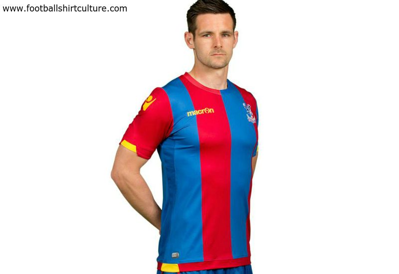
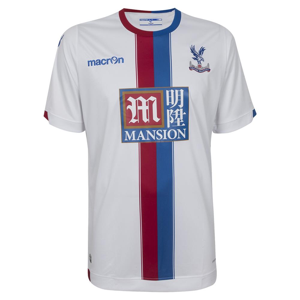
Crystal Palace (Macron)
Such an exciting team, but their new home kit is just so plain. It’s good to see Crystal Palace is an equal opportunities employer owing to the fact they seem to have employed someone who is colorblind to design their kit. Resembling one of those optical illusions that were all the go back in the 1990s, if you place your nose up to the material you will find pictures of Marouane Chamakh’s hairline. Awful. The white away shirt is a bit better, and features a red and blue combo stripe running down the center of the shirt. I suppose if they continue where they left off last season, nobody will really notice their poorly designed kits.
Home kit (0/5) – Away kit (2/5)
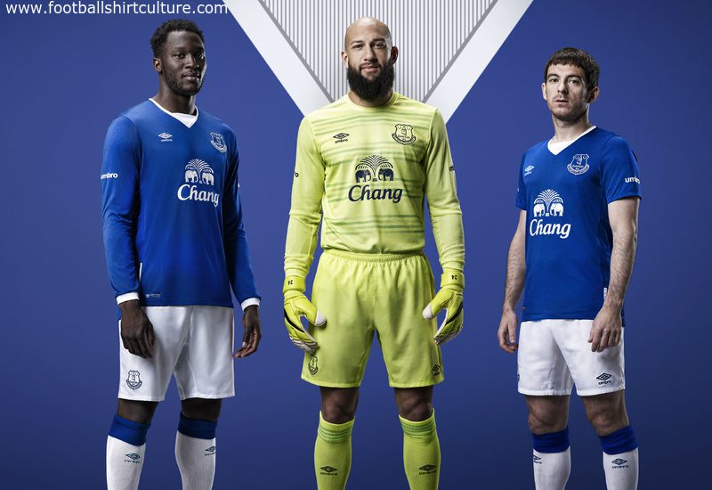
Everton (Umbro)
Everton were early frontrunners this year, unveiling their new kit in the final game of the 2014/15 season against Tottenham Hotspur. This season’s affair reverts back to a white V-neck design that was last seen in the 2009/10 and 2012/13 kits. It will be interesting to see how the Umbro insignias on the sleeves will match up once the Premier League badges have been placed. Everton’s sponsor, Chang beer, is delicious and looks great against the synonymous blue and white that splits Merseyside in half. According to Wikipedia, “Everton-Chang is a village on the Khao Lak coast in Phang Nga Province of Thailand. It consists of 50 houses and a football field. It was built following the 2004 tsunami that struck the area and destroyed the existing village of Ban Naan Khem. Local youth teams compete for the Chang-Everton cup. Officials from Everton F.C. and Chang Beer have been involved in the project. Together, they sponsor Chang Everton Football Cup and send promising Thai footballers to Liverpool for a trial with Everton.” Fascinating stuff shows how well a sponsor can work between a team and a community.
Home kit (4/5) – Away kit (3.5/5)
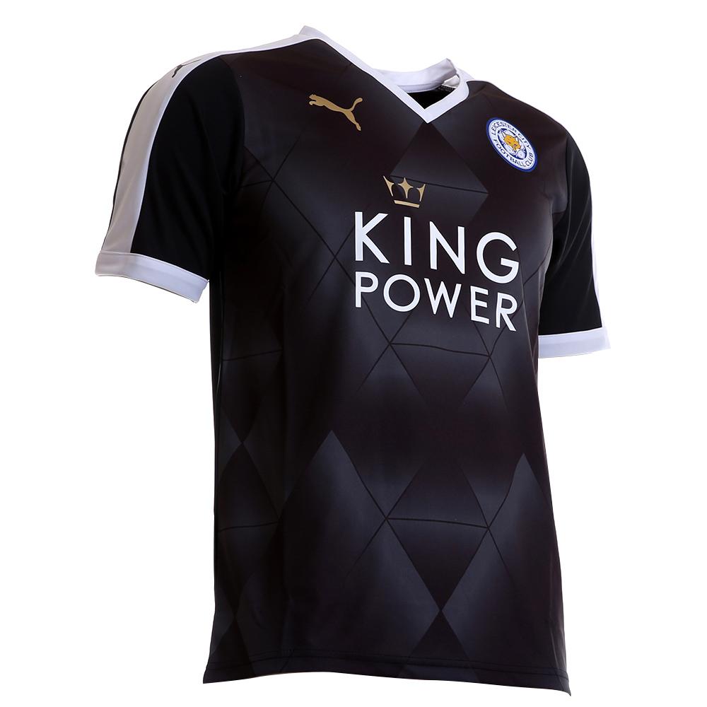
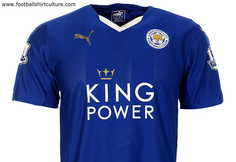
Leicester City (Puma)
The Foxes did the unthinkable last season in avoiding the drop after they seemed dead and buried at March. After the sacking of Nigel Pearson, was it the Italian national team influence of this kit that landed new manager, Claudio Ranieri to Leicester City? This season marks a return to all blue shirts and shorts for the first time since the 2008/09 season. The club crest appears too high on the shirt, and the gold trim makes it look like Leicester are celebrating surviving relegation. Their away shirt is black with a diamond-panel design on the front. There are white stripes on the shoulders that continue on the sleeves, and like the home kit, the collar is a loose fitting V-neck.
Home kit (2.5/5) – Away kit (3/5)

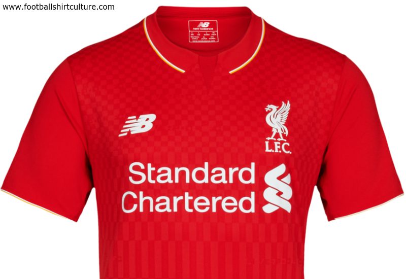
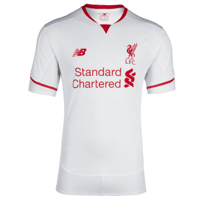
Liverpool (New Balance)
Drab. Very drab. New Balance, parent company of last season’s kit, Warrior, present a faux collar and checkerboard pattern on the body that wouldn’t look out of place at a BBQ joint. The official PR spiel is that the checkerboard signifies the flags and scarves Liverpool fans sat in the Kop End of Anfield raise at the start of a home game whilst singing “You’ll Never Walk Alone”. The rubber New Balance logo and Liverpool crest only go and add insult to injury, making the kit look tired and dated. The kit receives a consolation point for the embroidered “96” with a torch on either side, service as a warming touch in remembering the victims of the Hillsborough disaster. The away kit is all white with red trim on the sleeves and collar. A minor improvement from last season’s horrendous kits, let’s hope the team improves as well.
Home kit (1/5) – Away kit (2/5)
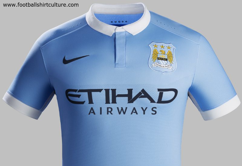
Manchester City (Nike)
Premier League runners-up, Manchester City, keep it simple with their sky blue and white design that happens to be one of the best kits of the lot. With a polo shirt collar, the shirt is so smart it looks like you could wear it to meet your significant others family for the first time and win over Grandma by desert. Bonus points are awarded to Manchester City owing to the fact it doubles as a New York City F.C. jersey if you squint a little bit.
Home kit (5/5) – Away kit (4.5/5)

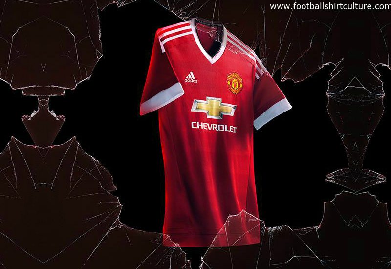
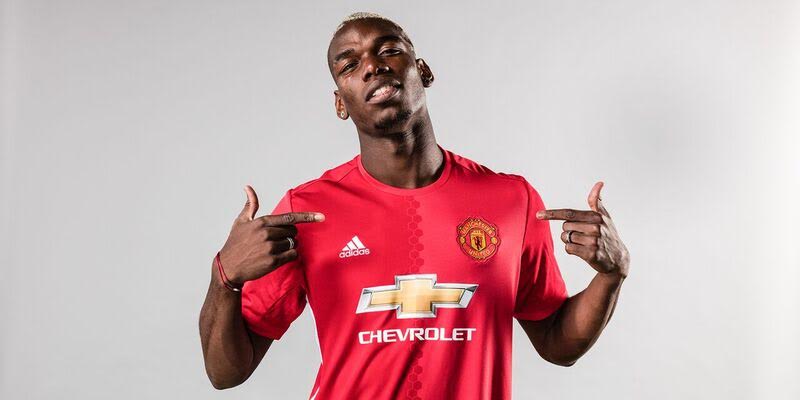
Manchester United (Adidas)
Finally! Manchester United was the last team to reveal this season’s kit after their contact with Nike expired on July 31st. Adidas takes over in a 10 year deal worth an astonishing $1 billion. The simple kit has been inspired from 1980s classics with the iconic Adidas three strips and V-neck collar. The hem on the shirt is rather strange though. What is it exactly? “MU”? A devil’s trident? Or a heart EKG predicating Manchester United’s up and down season? The female version of the kit is causing controversy as it features a lower v-shaped neckline which has been called “sexist and inappropriate for football.” I think the female version should be the male counterpart also so we can see Wayne Rooney’s beautiful cleavage as he scores in front of the Old Trafford crowd.
Home kit (4/5) – Away kit (N/A)
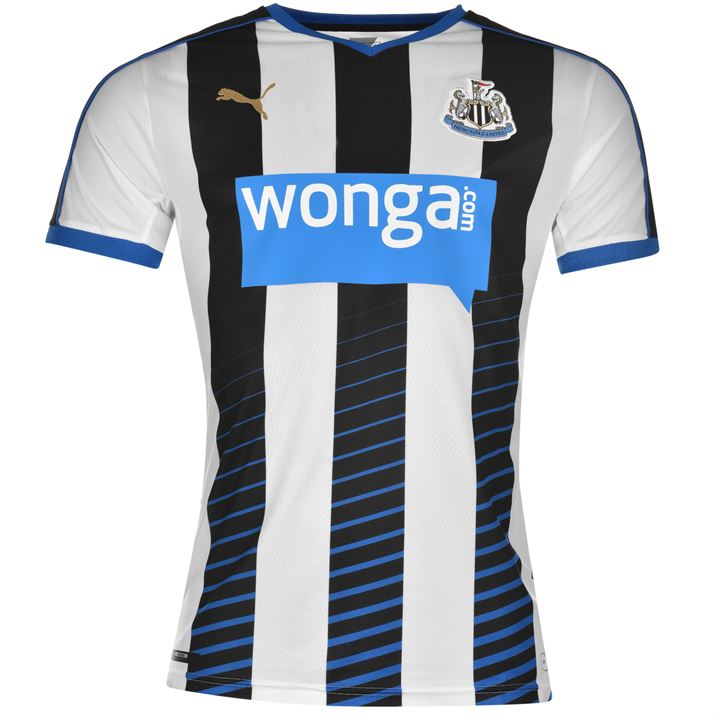
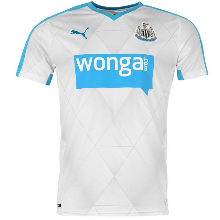
Newcastle United (Puma)
The Tyneside club stick to their traditional black and white strip for their home jersey. This season’s shirt features three large black stripes down the front, and a fading hoop design running across the stripes. The sky-blue trim around the V-neck collar, sleeves, and bottom portion of the back add a very nice touch. The away kit is a creamy white with a diamond water-mark design on the front. It also includes a sky-blue trim around the collar and on the armpits. Not the best looking kits, and as a result, an average rating.
Home kit (3/5) – Away kit (3/5)
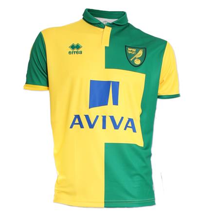
Norwich City (Errea)
The Canaries are back in the Premier League, and will be hoping their football gets people’s attention and not their horrible kit. The home jersey feature a polo style shirt with a two-color block design: yellow on the right with green sleeve, and green on the left with yellow sleeve. The sponsor block on the front of the shirt is too large, and ruins the shirts already struggling appeal. The green away kit looks a bit better in regards to sponsor placement, featuring yellow stripes on the front and back. The trim on the sleeves are a combination of yellow and white.
Home kit (2/5) – Away kit (3/5)
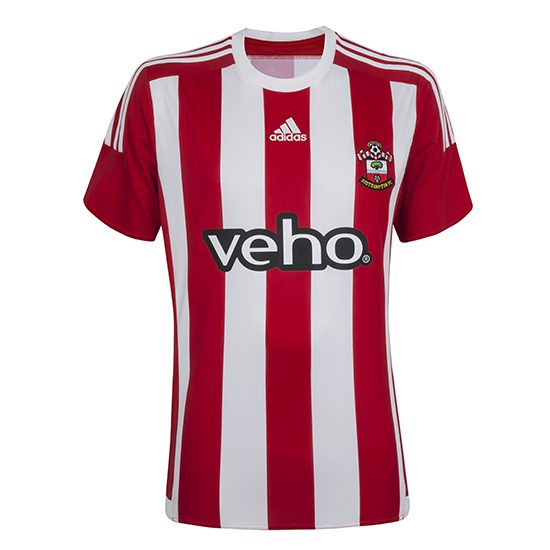
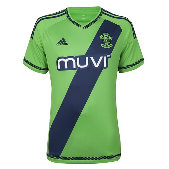
Southampton (Adidas)
The Saints new Adidas shirt features a combination of red and white stripes with the Adidas logo placed underneath the collar. It also has the traditional three stripes associated with most Adidas shirts running down the shoulders. The away kit features a different sponsor than the home kit (Veho on the home, and Muuvi on the away). It’s green with a thick navy slash diagonally across the shirt with a knitted design on the collar and sleeves.
Home kit (3.5/5) – Away kit (3/5)
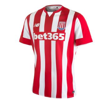
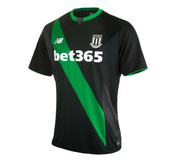
Stoke City (New Balance)
The Potters stay with their normal red and white stripe design for the home kit. The shirt contains a crew-neck collar, but the white detail in the middle gives it an illusion of a V-neck. The away shirt is black with a green dash running diagonally across the front. There is also green trim around the collar and shirt sleeves.
Home kit (3/5) – Away kit (3/5)
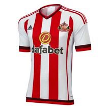
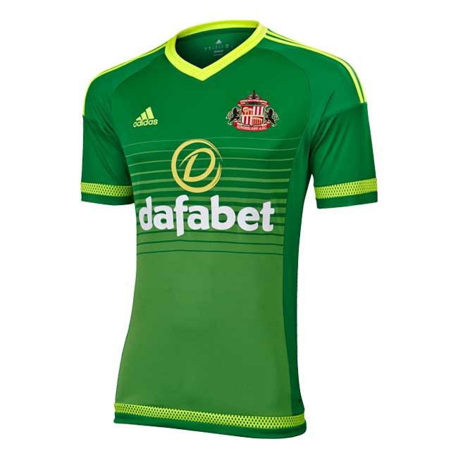
Sunderland (Adidas)
The Black Cats don’t change much on their home kit aside from their shirt sponsor, now Dafabet. The traditional red and white stripes remain with burgundy and red trim on the sleeves and V-neck collar, plus the bottom of the shirt. The away kit, on the other hand, is a hot contender for Worst Kit of the Season! The swamp-green shirt features a yellow knitted hoop design on the sleeves, collar, and bottom of the shirt. The faded style hoop design on the front of the shirt does it no justice. Perhaps the designers thought that if they wear this shirt they won’t be invited to the relegation party. Clever.
Home kit (3.5/5) – Away kit (1/5)
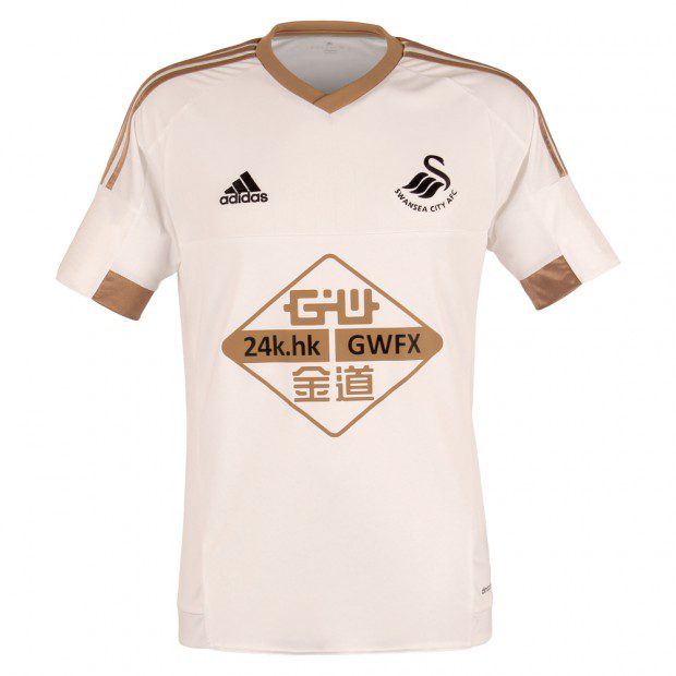
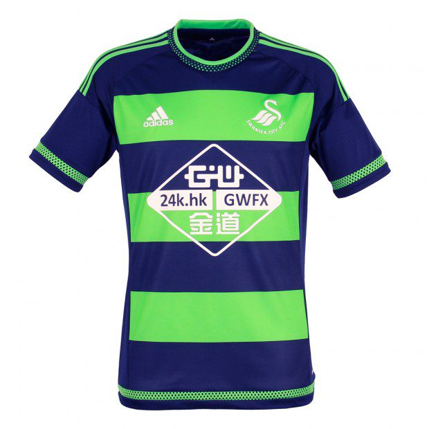
Swansea City (Adidas)
The Welsh-based club stick with their swan-white shirt with copper stripes on the shoulders and a copper colour block on the inside of arm sleeves. The colour is inspired by the copper mining industry in the city. The away kit is neon green with navy hoops and a knitted design on the collar, shirt sleeves, and bottom trim.
Home kit (4/5) – Away kit (2.5/5)
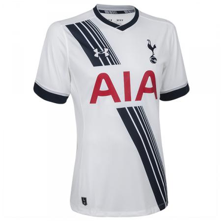
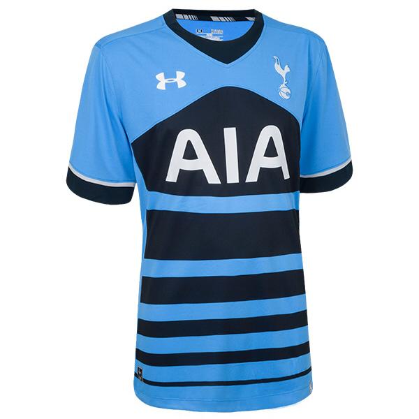
Tottenham Hotspur (Under Armour)
The Spurs will play their home matches in their normal white kits, but this season will feature disconnected lines running diagonally across the shirt. The shirt also includes navy blue trim on the sleeves and collar. The away kit is navy with a sky blue background and has a faded hoop design. The sleeves have a navy trim. Not the best kit Tottenham has played in.
Home kit (2.5/5) – Away kit (3/5)
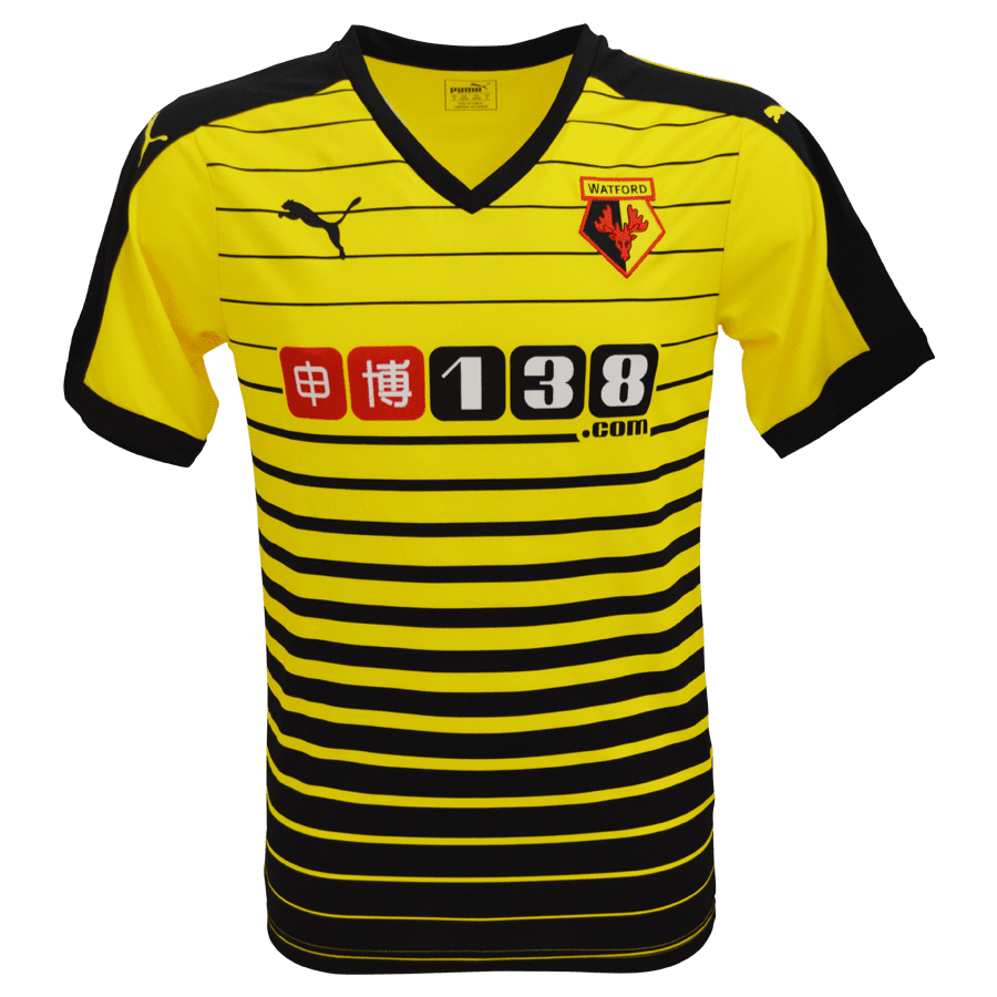
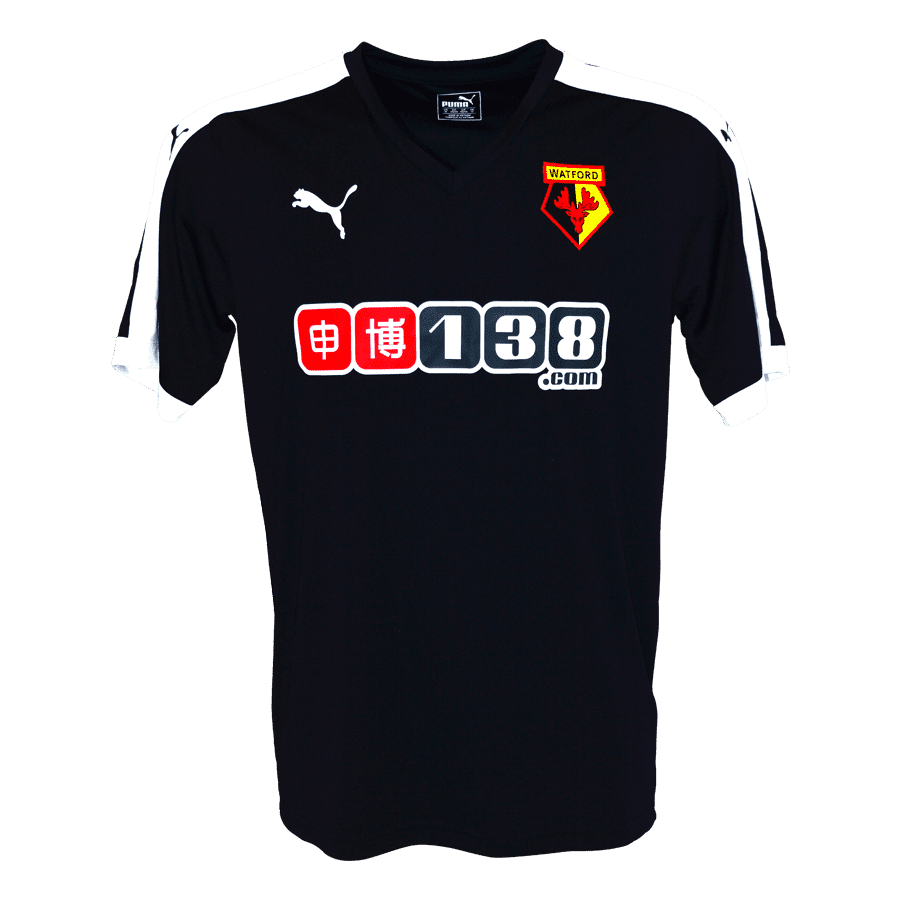
Watford (Puma)
Newly promoted Watford’s yellow and black home kit is another contender for worst of the season, featuring a faded hoop design on the front of the shirt with a very deep V-neck. Deeper than Drake running through the six with his woes after a difficult break-up. The away shirt also has a deep V-neck, and is black with one thick white stripe on either shoulder plus the sleeves.
Home kit (1/5) – Away kit (1.5/5)
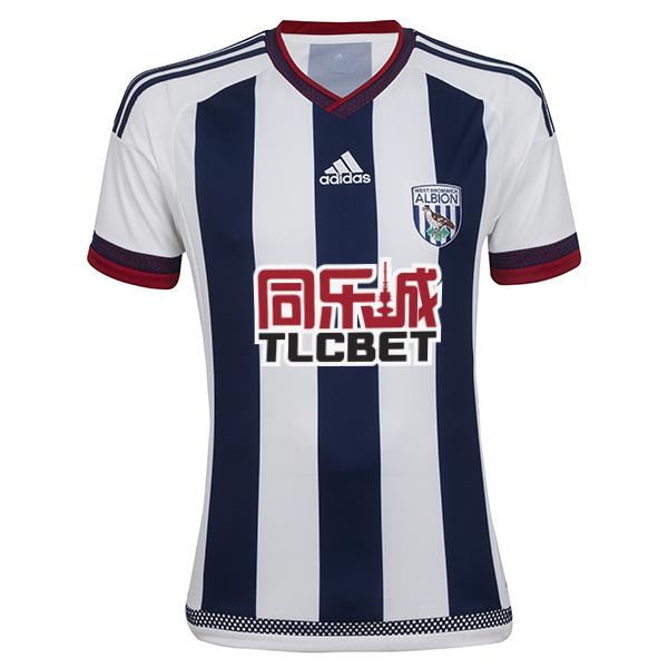
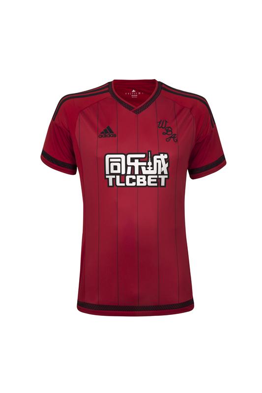
West Bromwich Albion (Adidas)
The Baggies will have three navy stripes on the front of their shirt with the Adidas logo, similar to Southampton, underneath a V-neck collar. The red knitted trim on the sleeves, collar, and bottom of the shirt look to be synonymous with the Adidas kits this year. The away kit is red with thin black stripes running down the shirt. West Brom have decided to stick with their old crest, with the acronym W.B.A, instead of their current club crest. Not a bad kit at all.
Home kit (4/5) – Away kit (4/5)
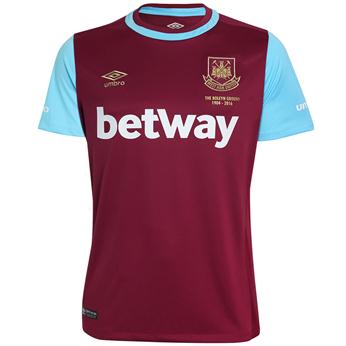
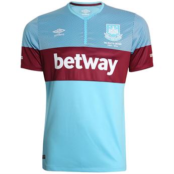
West Ham United (Umbro)
The Hammers will be leaving their Boleyn ground stadium after this season, and as a result have decided to pay tribute to their time there through their new season shirts. The home kit is the traditional claret with sky blue sleeves and hoop around the neck. There is also a commemorative crest with the years spent at the stadium. The away kit is sky blue with a thick claret hoop across the chest, and has claret sleeves. It contains the same Boleyn tribute as the home kit. This one is by far one of the most aesthetically appealing kits of the season.
Home kit (5/5) – Away kit (5/5)
Do you agree with our rankings? Leave a comment below, and let us know which one you think is the best, and worst.
Written by Karzan Sulaivany in collaboration with Ciaran Finn.


